Thursday, June 30, 2011

The Girl With The Microfiber Turban


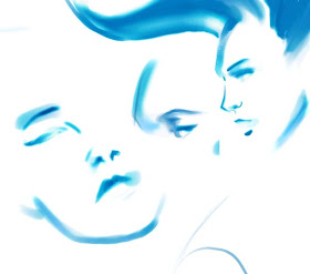
Well, okay, I'm not sure it's a microfiber, but it's some sort of moisture-wicking synthetic. I just got word today that they want me to finish up all 5 of the proposed illustrations by Tuesday, so I need to make at least 1 a day. This one was inspired by the pose of the classic "Girl With The Pearl Earring," but I always did like a pose looking over a shoulder. I always thought it was more elegant... maybe because of the roundness of the back and the S curve formed by craning your neck...? Anyhow, I'm quite happy with this initial face rendering: she looks like she could be someone real (well, to me anyhow), except I didn't copy anything. I get so much satisfaction when that happens. Hmm, although I think her right eye could use some tweaking... it seems a bit too close.

Tuesday, June 28, 2011

Getting Her Spa On, Too

This is looking like a retro 60s illustration, which I don't mind, but I'm not feeling the "watercolor" effects that I was supposed to render, as with the printing techniques for this run, this is looking more opaque like gouache and not transparent and wet-on-wet. Still, it's not bad, so I'm sending it off to the client for critique.

Getting Her Spa On

Last night the sketch seemed to come together - I got more details in that I liked, and got a feeling for how to render the watercolor effect that the client wanted, although I'm still a bit unconvinced this is the way to go. It's lacking a bit more elegance, and I really want to retool it. Just don't know without redrawing the whole thing, which I don't think I want to do just yet...

Monday, June 27, 2011

Revised


Little details matter so I fixed up her stance a little, making it a bit more windbown and contraposto, to try and get the S curve that was so much stronger in the other pose they liked, but with this facial profile. I seem to be losing her plum line though... well, this will be heavily retooled by the time I color it, I'm sure.

Sunday, June 26, 2011

Zenaida's All Wet

Well, wet on wet watercolor technique... simulation, that is, in Photoshop. I was researching watercolor simulations in Photoshop and one woman had a fairly convincing technique, so I decided to put it through a quick test. With a few tweaks here and there, I daresay it could work...!

Friday, June 24, 2011

Bathrobe Beauties

I'm somewhat exhausted but completely thrilled to be working on illustrations. It's exhilarating to be on an actual job that isn't necessarily some sort of afterthought (which more than a few of my illustration projects at my last position felt), having gone through the briefing process, the writing of a detailed contract, and now getting started in earnest with initial sketches. I did a lot more than I needed to, but I've been excited about I'll be creating! I've spent the last couple of weeks sussing out techniques, and the last couple of days figuring out poses, which I'm showing in my rough sketch form here. I hope that this project really comes to fruition...!

Lalala, I'm just relaxing here in myself, spending quality time with my plush bathrobe in front of my wind machine...

Thursday, June 23, 2011

Wet and Wild

I had myself a couple of "eureka!" moments while heading out to the gym, and then later by looking over the styles of fashion illustrators that I wanted to channel for this illustration job I'm working on, and I finally feel a direction I can start with. The forms are my own but the paintwork is a mixed homage to various illustrators both current and past. I'm hoping that the client likes the direction, but I have a few more days to work on it as I have poses to draw tonight, since that's what I'm presenting tomorrow.

Painter Essentials 4


I'm experimenting with the watercolor brushes in Painter Essentials 4. They're not much more developed than Essentials 2 than I thought, although there's a few more tonal controls you can have with the blenders. Still experimenting with what approach I'll take for my freelance job...

Wednesday, June 22, 2011

Wash and Weary


Sunday had so many images posted, plus a second post for Heron that I thought I'd give my arthritic fingers a rest, haha! Seriously though, I may be gripping my pen/stylus way too hard. Anyhow, have a new freelance drawing job I will be no doubt posting a lot about in the next few days so I'll just do a quickie with this for tonight. I have to figures using draw bath products but I'm trying to make them somewhat dynamic...

Monday, June 20, 2011

Bobby Mc and his friend Heron

Bobby and his friend Heron wait for their groupies to show up.

Sunday, June 19, 2011

Fashion Illustration Meetup

I attended a meetup session for a Fashion Illustrator's group that meets a couple of blocks away from my apartment. I was a great session, because while I didn't come away with any drawings I loved (and most I barely liked - none of these are good drawings, IMHO), for my inexperience and insecurity with the media (mostly watercolor) and in the timed sessions, I think I did okay. I was quite pleased with my attempts to do more complex work with unfamiliar techniques, but ran out of time with all of them. Still, it was all about the attempts and practice I got.

The 5 minute (or was it 2? I can't recall) contour sketches I enjoyed, because there was no time to consider the aesthetics, merely to go on autopilot, and they were a great way to get your feet wet, so to speak, at the start of the 3 hour meetup. The model Tomo was wonderful, especially because she had these amazing legs that just had so much rhythm to their shape. I loved just swishing the lines on the paper to capture them, even if after taking the pics to post, my lines seem less shapely than I imagined they were when I initially drew them! :) I happy that my fashion proportions are still very much intact, though.. maybe even moreso than ever. I didn't erase on any of these quick contour sessions, and I still think I got most of the attitudes of the poses.

The 10 minute (although I think they were actually 5... can't remember) sketches were a bit easier... except for the fact that they dressed her in these patterns that were insane to render. I defaulted to colored pencil just to get my bearings, but while the drawings are a bit better, they're just drawings. I didn't feel I was getting any fashion illustration practice.

I was quite proud of myself for my brushstrokes in these full-color watercolors, because I put colors down fearlessly (for me). Fashion illustration for me is all about confident strokes, and I don't have them down yet, not with proper placement and coloration. But that's what these practice sessions are for. I was at least using the whole sheet, but these papers were not made for watercolor - the pigments dried almost immediately, making it impossible to get a wet-on-wet technique going. These were a 20 minute pose (on the left) and a 15 minute one (right) that I wish I had more time for.

I was quite pleased with myself for these ink paintings. I've never painted with ink before, and I was trying to create textures since I wasn't going for color (in this outfit, the colors were a bit muddy). I abandoned the one on the right because I didn't like how the polka dots were rendering, so I redid it (left) without drawing them in with a pencil first. I was quite happy with that effect, although I like the hat in the former better, hence the trial two sketches on display here. I ran out of time before I could complete either.

This sketch I am probably the happiest with. While I didn't really get the feeling of the fabric, I loved how the chiaroscuro on the legs turned out. I was trying to channel Bil Donovan, who is a master of ink painting. I'm millions of miles away from his level, but for a first time attempt, I'm quite happy with those legs!

Mohawk Storm Too


I'm too tipsy tonight after some strong cocktails (again!) after a movie tonight, so I'm just not feeling like drawing anything. I thought I could mindlessly sketch if I had music to listen to, but nothing is making the creative juices flowing. So these are just little bits and bobs on the original sketch.

Saturday, June 18, 2011

Mohawk Storm: Vest

I just spent a little of time last night fleshing out clothing details, mostly because I had an upstairs neighbor come visit me last night and she ended up staying 5 hours while we drank frozen margaritas. So not much time (nor fine motor control) for any drawing!

Thursday, June 16, 2011

Girl With The Glaser Hairdo, Revisited

While looking for files to bring to a meeting with an illustration client, I came upon this unfinished piece from a few weeks ago. Funny how time makes you see flaws you didn't notice too clearly the first time. So I went about fixing her features to my liking, though not completely happy by a long shot. Still haven't finished her either.

Mohawk Storm

I think my love of the X-men really matured around the time Chris Claremont started really shaking things up, changing the formerly serene Storm into a punk rock rebel who was the antithesis of everything she used to be. It was both infuriating and completely compelling, because I was thrown such a curve (as was everyone) and we could not wait to see what happened next. And what happened was the character grew into what became a Claremont archetype that no one else has done as well since (not even Claremont, I dare say). It was a moment, really.

I wanted to just draw the way I feel like I would draw now, but doing subject matter that was very formerly me. No attempts to capture the way I used to draw, more about seeing how I would tackle the subject matter almost 30 years later. I like the pose, and am curious to see how I flesh it out.

Tuesday, June 14, 2011

Knifed

I wanted to try a looser technique, something like the pastels I've been doing (albeit digitally). I thought I'd do my watercolors again, but after drawing in a pencil sketch, I didn't feel like breaking out the water and brush. So I pulled up a photo I wanted to base things on, then started doodling. This isn't a good portrait of the actual model, but it's an attempt at some looser technique using mostly the Painter palette knife tool. I don't like it reduced in this preview, although I didn't mind it when I was actually working on it.

Sunday, June 12, 2011

Loose Lines


I went back to digital drawing today but it didn't feel fun. I desperately wanted to do another watercolor piece, but after having a modicum of success with yesterday's piece, I was afraid that successive attempts would be dishearteningly bad. Agh, fear of failure...!

Watercolor Test 2

The current master of watercolors in fashion illustration these days is David Downton, just like it was Antonio Lopez back in the 80s. I remember copying Antonio's work to try and find out how he created his pieces, and constantly aping him led to me imbibing his style, which I later started to develop my own from. I figured it might behoove me to do the same with David Downton, since yesterday's piece was so disappointing. I drew a face without any references, then I looked online for Downton illustrations I could study, to see how he treated them. I actually like how this turned out a lot, although I can certainly see more development in my technique. But while I didn't copy any of his work, I did look at his pieces to get a sense of his shading, wet on wet technique (I tend to use a very dry brush, maybe a too-much-Photoshop effect) and color placement, then channeled it through my own technique (or lack thereof). I have a ways to go but I think this is a good start. I'm particularly happy with how I made the lips - they're not necessarily like Downton's own technique in color application, but my own interpretation. There may be hope for me in natural media yet!

Friday, June 10, 2011

Watercolor Test

My sketch from the other day is shaping up to be a nice composition, and as a result, I was a bit trepidatious about how my watercolor skills might ruin it. So I did a test drawing and sure enough, I don't have the certainty of technique I used to - I had no instincts kick in, no signature techniques, nada. And my eyes are definitely weaker - I couldn't get into the details the way I used to. Gotta brush up on my watercolors!

Casual Storm

My croquis from a couple of days ago became a template for Storm wearing rolled up sweats and her old costume. Maybe she was doing yoga, hah! But I always liked it when the X-men used to show the mutants in 'lifestyle' looks, and doing normal things, because it showed that they had lives beyond their adventuring. It seems that, as I read some of the comic boards I used to frequent, the exploits of my once-favorite comic book characters are just steeped in way too much hyper-drama, and readers just can't relate anymore. Or at least it seems to me.

Thursday, June 9, 2011

Negative Inspiration

I can't believe I actually picked up pencil and paper and am going to try and do a finished piece. I was feeling down because I learned that a job I had been vying for fell through, and I was already feeling a bit despondent this week. But for whatever reason, that disappointment had the effect of inspiring me, and I not only found forward movement on a design project I've been stymied by for months, but I got this image in my head of a piece I should paint in watercolor, just like I used to before I had access to a computer. It amuses me how familiar the process is despite the fact that I haven't bothered to do anything like this (in earnest) in what seems like years. Of course, every mistake I made I had the reflex urge to hit Command Z... and instead reached for the eraser my friend Rima gave me, with the word "Wrong" emblazoned on it. Hmm, maybe someone should make an eraser that has "Command +Z" on it...

Wednesday, June 8, 2011

Done Undone

I just left it as a croquis because I kinda liked the sinews of her form. I didn't really want to cover it up. Sadly, I sometimes just take pleasure in the rendering that isn't complete, as opposed to finishing anything. I seem to have too few finished pieces in my portfolio nowadays.

Tuesday, June 7, 2011

Paring Down The Form


After yesterday's appropriation of technique, I wondered to myself how it would look applied to a more conventional drawing style, and it began looking like some of the old stuff I used to do back in my Silicon Alley days, with me playing with gradients on it. Could be fun to develop!

Sunday, June 5, 2011

Solid Style


I found a link to the wonderful work of illustrator José Luis Agreda, and his simple and solid linework appealed to the part of me that has always liked the 50s/60s style illustration that has influenced my more finished cartoon work. I have always drawn Zenaida in a sketchy manner, after the work of Edward Sorel as well as a few Filipino cartoonists from (IIRC) the defunct "Ms." magazine. But this sketch uses the digital pastels, solid shapes and colored outlines (check my profile pic for this blog, as an example) I've been getting into in the past years, albeit not all in the same sketch. So I decided to copy his style outright and see how it adapted to my sketches. I think Zenaida looks gorgeous this way (which is probably why she's so coy)!

Zenaidique?


Zenaida as Mystique needed to be in color. Although she looks like some sort of fertility Smurf.

Saturday, June 4, 2011

The Mystique of Zenaida

I watched X-men:First Class today and liked the backstory for Mystique (even if I prefer Rebecca Romjin instead of Jennifer Lawrence) so I went back in and watched X2 again. I'd forgotten how well done that movie was, despite some of my misgivings as a fanboy. Anyhow, I scribbled on my pad beside me while watching, drawing my character Zenaida with Mystique's signature scaly look...

Friday, June 3, 2011

Happy Music

Penguin Prison makes me happy. I love their remixes of other artists' music, but even moreso I love their own songs. So while listening to Golden Train, I thought that nothing could quite echo those feelings of musical joy except a cavorting Zenaida. Et voila!

Wednesday, June 1, 2011

Eric and his friend Heron

Eric and his friend Heron take their Tornado Watch duties very seriously.

Mannequin Walk, 3

I think this should be as far as this drawing gets revised. I won't be improving it unless I get some serious reference going on to really firm things up in my mind. I tried to clean out my lines, which are really 'searching lines' that might not be the right placement but close enough, to fool the eye. But when I refine things to the point that they're supposed to be finalized lines, I end up redrawing them again and again, and the search lines start to look like they were a better option. So let me distract you with weird color. Heh.

His torso is really long. Not that I mind. I like guys with long torsos, maybe because I have a short one.